
This document builds upon the basic Insights concepts and provides a framework to help you build impactful and meaningful dashboards that answer your business questions.
Dashboard building consists of these main steps:
- Start with a purpose
- Identify business questions
- Choose reporting metrics and group them effectively
- Select the right visualization technique
Start with a purpose
Start by defining your purpose and audience. Your audience typically falls into two categories:
- Tactical users include integration leads, builders, and similar roles who build and maintain automations. They need granular data to monitor performance, troubleshoot issues, and resolve errors.
- Business users include executives, department leaders, and similar roles who monitor the business value of automation initiatives. They need high-level insights to understand business impact and make informed decisions.
Each audience requires a different dashboard approach.
Operational dashboard
An operational dashboard displays detailed workflow performance data. It typically includes job activity, failure rates, and recipe usage. Use this dashboard type when your audience consists of tactical users who monitor and troubleshoot automations.
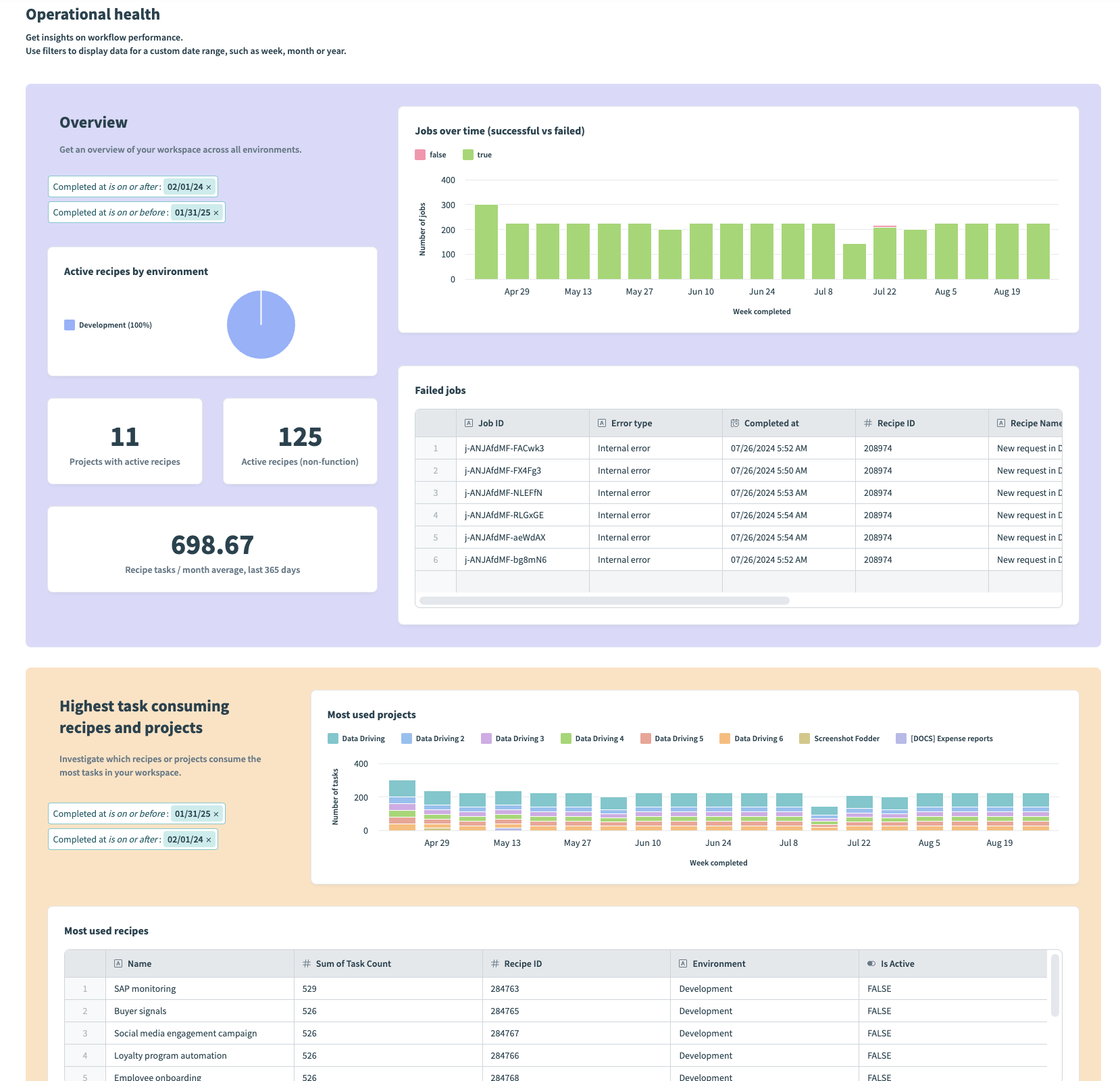 Example operational dashboard
Strategic dashboard
A strategic dashboard displays a high-level overview of automation adoption, value delivered, and team usage across your organization. It typically includes KPIs and other key metrics that help leadership allocate resources and plan strategically. Use this dashboard type when your audience consists of business users.
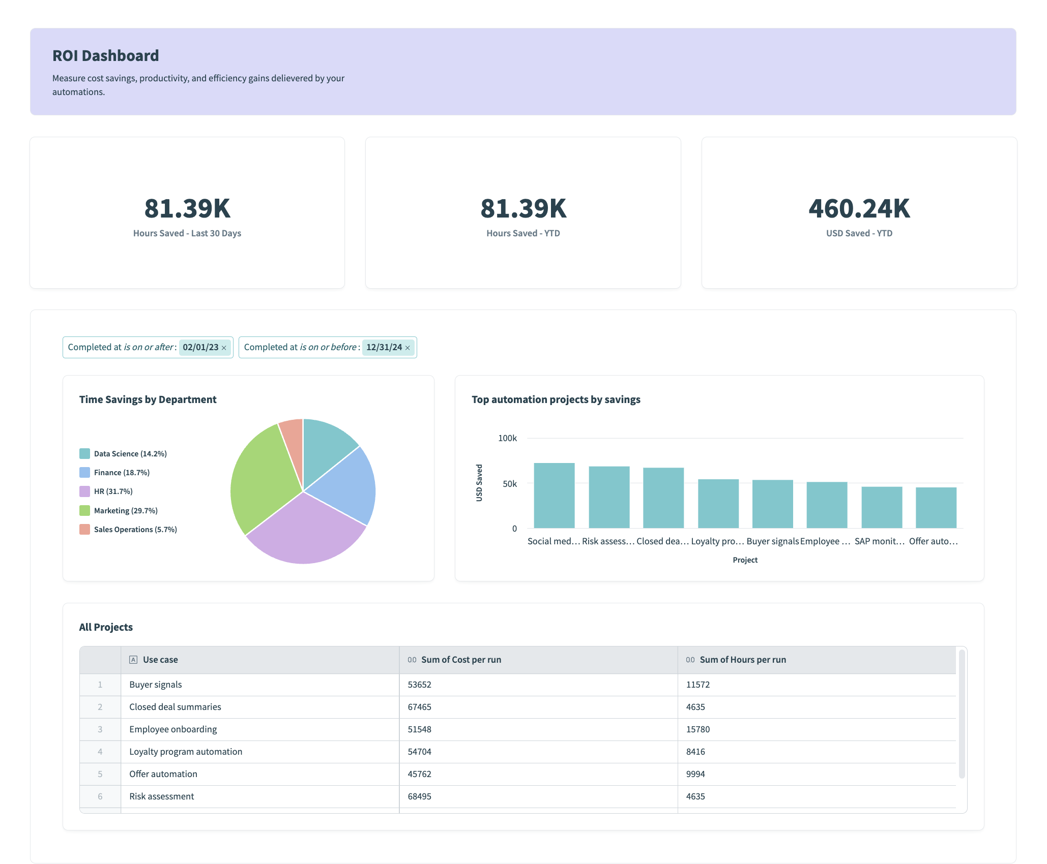 Example strategic dashboard
The following table summarizes the key differences between each dashboard type:
| Criteria | Operational dashboard | Strategic dashboard |
|---|---|---|
| Who uses it? | Tactical users | Business users |
| What do they need? | Granular details | Actionable insights |
| What will they do with it? | Investigate issues and solve problems | Allocate resources and plan initiatives |
| What is their data literacy? | Highly literate | Interested in the big picture |
Identify your business questions
Begin by identifying the key questions you aim to address with your data. Data has the power to tell a compelling story when used effectively. Consider your audience and their distinct needs.
- If your users require highly detailed reports that focus on operational metrics, think about what data enables them to take action.
- If your users require reports on KPIs and other key metrics, think about what data enables them to make strategic decisions.
Key business questions:
- How many jobs ran this month?
- Are automations running smoothly?
- Which workflows are used the most?
- Which workflows fail the most?
Choose the right metrics and group them the right way
Now that you've identified the questions you plan to answer, you must consider what data you are going to use and how to organize it effectively to support your narrative. During this step, it's important to consider the measures (values that you plan to analyze) and dimensions (how you contextualize these values) you plan to use.
In an operational dashboard, you might start by answering: Which of my automations (metric) were used most this month (dimension)?
At a high-level, answering this question consists of the following steps:
- Aggregate the number of tasks run per recipe.
- Sort by the highest task count to determine the most-used workflows.
- Consider how you plan to group this data, such as by day, week, or month, to contextualize it and report on trends over time. You can apply a filter within the chart editor, or use filter groups to apply a global date range to all charts within your dashboard or a specific container.
Select the right visualization technique
The appropriate visualization technique depends on the type of data you're presenting and the story you plan to tell. Different types of charts are better suited to conveying specific scenarios:
Use tables to display detailed data breakdowns, such as the top used recipes along with their respective job counts in a workspace.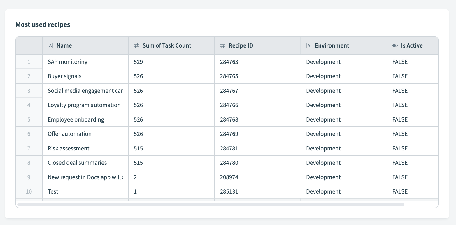 Table displaying most used recipes in a workspace
Bring it all together
Now that you understand your audience, business questions, key metrics, and the right visualization types, you're well-equipped to build your first dashboard. Focusing on these elements enables you to can create a dashboard that meets user needs, delivers valuable insights, and supports informed decision-making.
Comments
0 comments
Article is closed for comments.